THIS WEBSITE IS NOT MAINTAINED ANYMORE AND ONLY PUBLISHED AS A PROJECT ARCHIVE!
It contains summarised information previously found under www.integrated-assessment.eu.
A Guidance System for an Integrated Assessment
The Concept
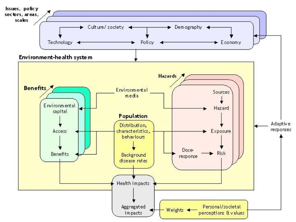
Integrated environmental health impact assessment provides information on potential environmental influences on public health, in order to help people make better decisions to protect and improve human health.
It can be defined as:
A means of assessing health-related problems deriving from the environment, and health-related impacts of policies and other interventions that affect the environment, in ways that take account of the complexities, interdependencies and uncertainties of the real world.
Key features of IEHIA are that:
- It is specifically designed to deal with complex issues, which would usually be beyond the scope of more traditional forms of health risk or impact assessment (see links to Other assessment methodologies, left);
- It considers both positive and negative effects on health – i.e. it recognises the environment as both a hazard and a source of beneficial resources (environmental services and capital);
- It attempts to provide a synoptic and balanced measure of impacts, by weighting and summing the various health effects;
- It is designed to be participatory – and thus to involve all the key stakeholders with interests in the issue.
Steps in IEHIA
The range of questions facing decision makers is large and varied. Integrated environmental health impact assessments thus take many different forms, and often need to be developed and adapted to match the spcific issue being addressed. The issues are also often complex, and touch the lives of a wide range of stakeholders. As a result, many assessments do not proceed in a neat, linear way, but are, instead, somewhat circular and reiterative.
In general terms, however, we can define four key steps in any assessment: issue-framing, design, execution and appraisal.
- Issue framing is done to define clearly what is to be assessed, and who should be involved.
- Design consists of deciding how the asssessment will be done - including the data and methods that will be used.
- Execution is the stage of actually doing the assessment - collecting the data and running the models to determine health impacts.
- Appraisal involves reviewing and interpreting the results of the assessment, and communicating these to the end-users.
These steps (known by their initials as the IDEA framework) provide a valuable structure within which to organise and run assessments. Following this framework helps to ensure that assessments are targeted as the right issue, are based on good scientific principles. Note also that stakeholders should be involved (in different types of discource) at every stage, in order to make sure that the assessment is acceptable to the people concerned, and thus that it can provide a sound basis for effective decisions.
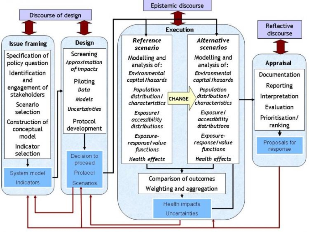
Issue framing represents the first stage in doing an integrated environmental health impact assessment. It is at this stage that we specify clearly what question we are trying to address, and who should be involved in the assessment.
By the end of the issue-framing stage, therefore, we should have defined the scope of the assessment, and the principles on which it will be done. In the process, we should also have resolved any ambiguities in the terms and concepts we might be using, so that everyone involved has a common understanding of what the results of the assessment will mean.
Issue-framing can rarely be done as a singular, one-off process. Considerable reiteration if often required to deal with new insights, as they emerge. The order in which issue-framing is done also needs to be adapted according to circumstance. Five main steps, can, however, be recognised:
- Specifying the question that needs to be addressed;
- Identifying and engaging the key stakeholders who need to be involved;
- Agreeing an overall approach to the assessment and the scenarios that will be used;
- Selecting and constructing the scenarios on which the assessment will be based;
- Defining the indicators that will be used to describe the impacts.
For the sorts of complex (systemic) problems that merit integrated environmental health impact assessment, issue framing can be extremely challenging (see link to Challenges in issue framing, left). Care and rigour in issue framing are therefore crucial if the assessment is to be valid and useful: failure to give the necessary attention at this stage will almost certainly undermine the value of everything that follows.
The Design stage in an integrated environmental health impact assessment takes forward the 'conceptual model' of the issue, defined during issue framing, and converts it into a detailed protocol for assessment.
This is necessary because issue framing only defines what we would like to assess. It does not guarantee that an integrated assessment is worthwhile or can be done, nor does it set out how actually to do the assessment.
Designing the assessment requires three further preparatory steps:
- Screening – to determine whether a full integrated impact assessment is necessary;
- Piloting – to determine whether a full integrated impact assessment can be conducted successfully;
- Protocol development – to specify in detail the study area and population, scenario, data and methods that will be used in the assessment.
None of these steps runs only one way. In many instances, they will reveal previously unforeseen factors that need to be included. They may also uncover contradicting evidence which cast doubt on some of the decisions or expectations in issue framing. As a consequence, the conceptual model of the issue may need to be reconsidered and revised.
Nor is the complete process necessarily carried out, for the first step in this stage of the assessment (screening) may show that an assessment is not merited, while feasibility testing may show that it cannot be done. In either of these situations, the assessment process can be terminated. In this case, further consultation with stakeholders will be required to explain this outcome, and to consider what should be done instead.
The execution stage is the heart of the assessment process; it is the point at which the full analysis is carried out and the results obtained.
The steps involved may vary, depending on the nature of the issue, the scenarios and the type of assessment. In broad terms, however, the process follows the causal chain. It thus comprises four main steps:
- Estimating exposures of the target population to the hazards of concern
- Selecting an appropriate exposure-response function
- Quantifying the health effects
- Aggregating the health effects into a set of synoptic indicators of impact
Because assessments involve a comparison between two or more scenarios, however, each of these steps has to be repeated, for each of the scenarios. Ensuring that this process is done consistently is crucial, for otherwise biases in the results are likely to occur. It is therefore essential that the assessment protocol is carefully and closely followed throughout the execution phase.
It is rarely the role of those who carry out the assessment to make decisions about how to respond in the light of the results. The outcomes of integrated assessments, however, are often relatively complex, and therefore need to be provided to decision-makers in a form that they can understand. In many cases, also, the end-users may request help in interpreting the findings, and in further assessing the possible consequences of their decisions. For these reasons, the boundary between assessment and decision-making is neither absolute nor impervious, but instead involves a dialogue between scientists, decision-makers and the other stakerholders concerned. The purpose of appraisal is to bring together, communicate and interpret the results of the assessment as an input to this dialogue. This involves two key steps:
- Reporting the assessment results - i.e. delivering them to the end-users in a synthesised and understandable form;
- Comparing and ranking outcomes - i.e. identifying and interpreting the messages that the results imply.
Neither of these is a wholly objective process. Each involves some degree of selection of what matters, and the methods (and even the langauge) used in each case almost inevitably act to shape the conclusions. In the apprtaisal stage, as much as at any other stage in an assessment, it is therefore important to guard against bias. To ensure this:
- appraisal procedures need to be set out well in advance, ideally as part of the assessment protocol, and these procedures need to be adhered to;
- appraisal should be an open process, involving the stakeholders;
- access should always be available to the underlying, more detailed data (i.e. the assessment results) on which the appraisal is based.